Section 1 of 5
Inter and Söhne share a single-storey g, not a purpose
The faces, who drew them, and what they were drawn for.
4 pieces here, and the complete roster is on the archive.
Start here
Inter and Söhne share a single-storey g, not a purpose
Inter, drawn by Rasmus Andersson and given away, and Söhne, drawn by Kris Sowersby at Klim and sold, answer the same question — how a grotesque behaves at fourteen pixels — and answer it differently. Set the same paragraph in both and the difference is not decoration.
Read →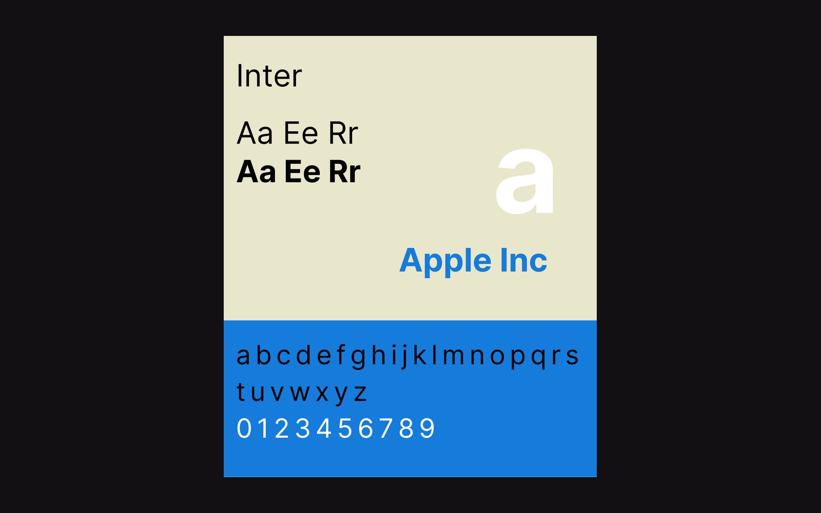
More in this section
- Variable fonts shipped in 2016, four-weight habit survivedA variable font is one file with an axis in it. OpenType 1.8 landed the format in 2016 and most production builds still ship four static weights out of habit.
- Georgia was drawn for 14px, Times ported from metalHinting, subpixel rendering and generous x-heights are screen problems. The faces that solve them were drawn after the problem existed, which is why they do not look like adapted book types.
- Rasmus Andersson self-funded Inter and answers to nobodyA retail licence, a foundry commission and a giveaway produce different faces: what gets drawn depends on who is footing the drawing.