The question underneath both faces
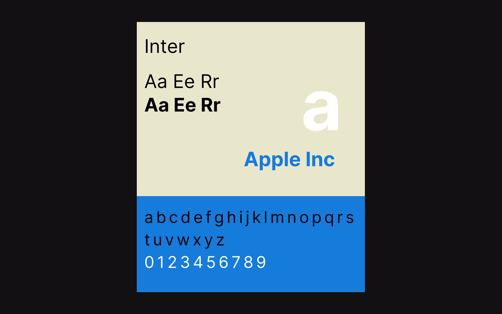
Rasmus Andersson started drawing Inter in 2016, working at Figma. He released it free, posted the source, and published it to Google Fonts, where it became — by a wide margin — one of the most widely used typefaces on the web. That trajectory is inseparable from the price, but it does not explain the design decisions, which are distinct and deliberate. Inter is optimised for screen reading at small sizes: tall x-height, open apertures, cautious optical weight. The letters are drawn so that a paragraph set at thirteen or fourteen pixels on a high-DPI display costs a reader nothing in effort.
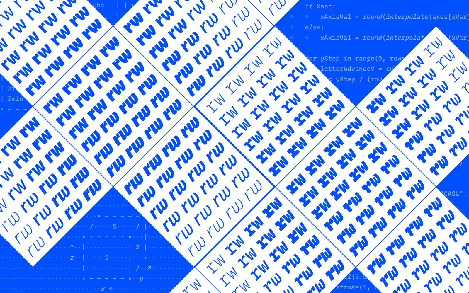
Kris Sowersby at the Klim Type Foundry in Wellington took a different starting point for Söhne, released in 2020. Where Inter's ancestry is Helvetica rationalised for pixels, Söhne's is Akzidenz-Grotesk remembered and redrawn — Sowersby has described it as what Akzidenz might be if it had grown up in a digital environment rather than a print one. The licensing is retail: a single weight, for desktop use, begins at pricing that makes a foundry license a deliberate decision. What you are paying for is that remembered warmth, and the specific decisions that preserve it at scale.
Both are grotesques. Both sit comfortably at fourteen pixels. That is where the surface agreement ends.
What the lowercase g actually does
The lowercase g is the clearest index of a grotesque's character because it has no structural obligation — it can take a single-storey or double-storey form and serve either way. Inter uses a single-storey g: a simple bowl, a clean descender tail, nothing that might close up at small sizes. The choice is legibility-first, the same reasoning that pushes Inter's apertures wide and keeps stroke contrast low. It is correct for the job it sets out to do.
What you are paying for is that remembered warmth, and the specific decisions that preserve it at scale.
Söhne also uses a single-storey g, as Akzidenz-Grotesk does. The difference between the two faces lies less in the structure of the letter than in what it is drawn to do: Inter's is tuned for legibility first, Söhne's for the character it inherits from its source.
Sit the two faces at fourteen pixels, body text column width, and the paragraph texture is visibly different — not because Inter is lesser type but because the two faces are solving different problems. Inter is attempting the condition of the best possible text rendering everywhere. Söhne is attempting to feel like it came from somewhere, and to carry that feeling without falling apart on screen.

The lowercase a follows the same logic. Inter's double-storey a, with its wide open aperture, is optimised for disambiguation — it cannot be mistaken for an o at small sizes or poor rendering conditions. Söhne's double-storey a is warmer and more particular. Set a long-form reading environment in each, and Inter's text is more neutral: the words carry; the face stays out of the way. Set a brand headline or a product name in each, and Söhne does more work with fewer words because the individual letters have more presence.
The rendering gap that explains everything
Hinting — the set of instructions embedded in a font that tell a rasteriser how to align outlines to the pixel grid — matters less than it did in 2010, but it has not stopped mattering. OpenType 1.8, which landed in 2016 and introduced variable font axes, arrived when web fonts were already ubiquitous. Inter is carefully hinted; it was built with screen rendering as the primary constraint, and Andersson has maintained the hinting tables through successive versions of the face. The result is that Inter on a Windows machine running ClearType still looks like Inter — the spacing holds, the weight reads correctly.
Söhne's hinting is competent, but the face is designed around the assumption that you are mostly rendering on a display where subpixel rendering is either irrelevant (Retina, OLED) or handled well enough that the design's intent carries. That assumption is largely correct in 2024 and was largely correct in 2020. It does mean that in marginal rendering conditions — older hardware, certain Android WebView configurations — Söhne loses more of its character than Inter does. Inter is robust because robustness was the brief. Söhne is beautiful because beauty, at the price of a licence, is permitted to be the brief.
Variable axes and what they give you
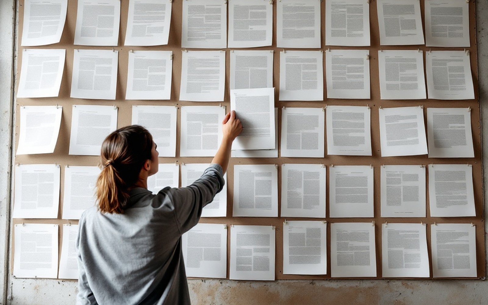
Inter ships as a variable font with a weight axis and an optical-size axis. The optical size axis is the rarer and more useful one: it adjusts the letterforms as the point size changes, opening apertures at small sizes and letting the design tighten at display sizes. Söhne at time of writing ships as a static family — Söhne Buch, Söhne Halbfett, Söhne Dreiviertelfett — with optical-size reasoning baked into the separate cuts rather than exposed as a continuous axis. Whether that is a limitation or a considered preference for the kind of typographic control a static family enforces is a question a designer has to answer for their specific context.
What the variable axis in Inter gives a product team is the ability to tune weight and size together inside a single file, which is an operational advantage independent of the aesthetic question. Linear uses a modified version of Inter with custom spacing and weight adjustments; the face's source availability made that possible. Stripe, whose typographic choices have influenced a generation of product pages, has moved between typeface families over time, but the kind of precision that Inter permits at the product-text level — fourteen pixels, tabular numbers, dense information density — remains the relevant model.
- 2010Ethan Marcotte's responsive web design article reframes what screen-native design means
- 2016Rasmus Andersson begins Inter; OpenType 1.8 formalised
- 2020Söhne released by Klim
- 2024Inter the dominant face on Google Fonts by usage
Neither is better
The useful professional position here is not that Inter is worse because it is free, or that Söhne is better because it costs something. Ethan Marcotte's argument in 2010 that the web had its own design conditions — not print adapted, but native — remains the right frame: a face that solves screen rendering well is not compromising, it is appropriate. Inter solves screen rendering very well. Söhne solves screen rendering well enough, and does something else in the space it saves.
What the lowercase g makes visible is the difference in intent. A brand that wants to disappear into its content reaches for Inter. A brand that wants the letter to land reaches for Söhne. The guideline can say whichever it likes; the glyph will have the final word.