
The retail model and its incentives
A retail typeface is a bet. The designer draws the face, the foundry publishes it, and the catalogue waits for buyers. That waiting shapes the design: a retail face needs to be legible in a specimen, appealing at headline sizes, and versatile enough to justify a licence fee across many kinds of use. It will tend toward the considered, the complete, the well-spaced. Kris Sowersby's work at Klim Type Foundry is a good example of what the model produces at its ceiling — Tiempos, Calibre, National, faces with clear optical personalities and full character sets, because an incomplete retail face loses sales. Grilli Type operates the same way: GT Walsheim, GT Super, GT America, each a serious investment against future licensing income. Neither foundry is drawing to solve a client's immediate brief; they are drawing for the longest possible useful life.
The incentive here is breadth. A retail face must work in contexts its designer cannot anticipate, so the type designer tends to be conservative about anything eccentric — the feature or weight that would delight one customer might repel ten. The Latin character set gets finished before the diacritics that serve smaller markets. OpenType features are included when they add catalogue value, not necessarily when they serve users.
Commission and giveaway, and what they optimise for
A commissioned face runs on different logic. The client has a specific size, a specific application, a specific problem. The brief might be: set dense data at small sizes in our product UI, survive dark mode, work across three scripts. That precision liberates the designer from retail breadth and constrains them toward genuine fitness. The Google Fonts commission model, which has funded faces including Roboto Flex and the expanded Noto family (the latter spanning over a hundred scripts and explicitly designed to eliminate tofu — the blank rectangles that appear when a system has no glyph for a character), shows what commission can do for coverage that retail would never fund commercially. No type foundry draws a 100-script retail face speculatively; a patron with a declared scope makes it possible.
OpenType features are included when they add catalogue value, not necessarily when they serve users.
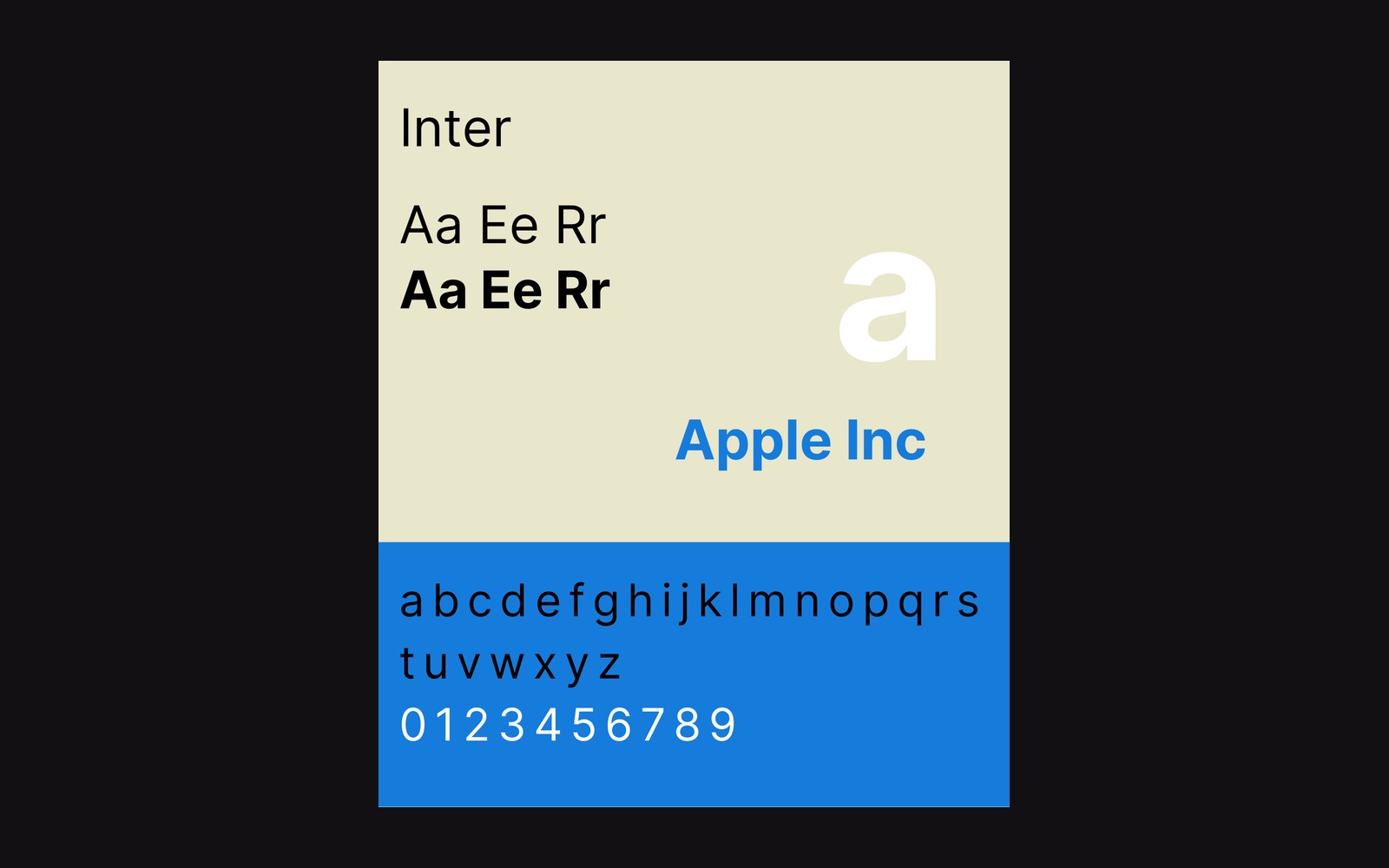
Rasmus Andersson's Inter is the third model: a giveaway, self-funded, purpose-built for screen UIs and released under the SIL Open Font Licence. Because Andersson owed no customer, no catalogue and no income target, Inter could be optimised for a single, exacting standard — a tall x-height and letter-spacing tuned for legibility at small sizes in interfaces. What it cost in retail breadth (early versions had no italic) it recovered in fitness for purpose. Stripe, Linear and hundreds of product teams adopted it, which in turn created the feedback loop that completed the family. The giveaway's economics are circular: adoption funds the next version, and the version improves adoption.

What the model leaves out
Each funding route leaves a gap. Retail misses scripts and languages that cannot support a catalogue. Commission misses the open-ended refinement that comes from a designer working on their own terms across years. The giveaway misses the diversity of contexts that paying customers represent — a face optimised for one category of use will be pulled toward that category even as it widens. The W3C's work on international text layout requirements documents how many scripts remain underserved by software and the web platform, a gap that the funding models above do little to close.
None of this is a judgment on individual designers. The model precedes the drawing. Before a curve is placed, the source of money has already decided whether this face will be wide or deep, complete or specialised, cautious or committed. That is the mechanical fact that reading about "design philosophy" in a specimen PDF will not tell you, and it is the thing worth knowing when you are choosing a face for a project that will be maintained for five years.