
The problem came first
A book typeface is designed at the size it will be printed. The designer controls the paper, the ink spread, the press. A screen typeface is designed knowing it will be rendered by an algorithm it cannot predict, on a grid of pixels it did not choose, at sizes ranging from 11px to 96px on the same page.
That asymmetry is the whole story. Type families drawn before the problem existed — Garamond, Caslon, even Helvetica — carry no memory of it. Porting them to screen means imposing letter shapes onto a pixel grid that was never considered when the strokes were drawn. The result is compromises in every direction: stems that land between pixels, thin strokes that disappear at text sizes, opticals that flatten under subpixel rendering.
Subpixel rendering, the technique of lighting individual red, green and blue elements within each pixel to simulate higher resolution, was Microsoft's ClearType, shipping with Windows XP in 2001. It helped. It also meant that the same file rendered differently depending on axis — horizontal strokes benefitting, vertical ones less so — which added another variable the type designer did not control and the book tradition gave no tools to handle.
- 1996Matthew Carter draws Verdana and Georgia for Microsoft's screen-rendering pipeline
- 2001Microsoft ships ClearType subpixel rendering with Windows XP
- 2016OpenType 1.8 formalises the variable font format
- 2017 onwardsInter published by Rasmus Andersson; deployed at scale via Google Fonts
What a screen face looks like from the inside
The answer that emerged was not to compensate after drawing but to draw differently from the start. Hinting — the set of programmed instructions in a font file that tell the rasteriser how to align strokes to the pixel grid — can be written by hand, but it is expensive and fragile. The more durable approach is to design letter shapes that survive the grid without needing heavy instruction: generous x-heights, open apertures, sturdy stems, deliberate spacing.
A high x-height relative to the cap height means lowercase letters hold detail at small sizes. Compare Georgia, drawn by Matthew Carter in 1996 specifically for Microsoft's screen-rendering pipeline, against Times New Roman ported from a 1931 metal original. At 14px, Georgia reads. Times at the same size works through familiarity more than clarity.
The result is compromises in every direction: stems that land between pixels, thin strokes that disappear at text sizes, opticals that flatten under subpixel rendering.
Carter's work for Microsoft in the 1990s established a template: draw the face for the problem, not for the tradition. Verdana (1996) and Georgia are screen-native in that nothing about them was derived from a print ancestor. The letterforms are wider than tradition demands, the spacing more generous, the contrast between thick and thin strokes deliberately reduced so no stroke thins to invisibility under rasterisation.

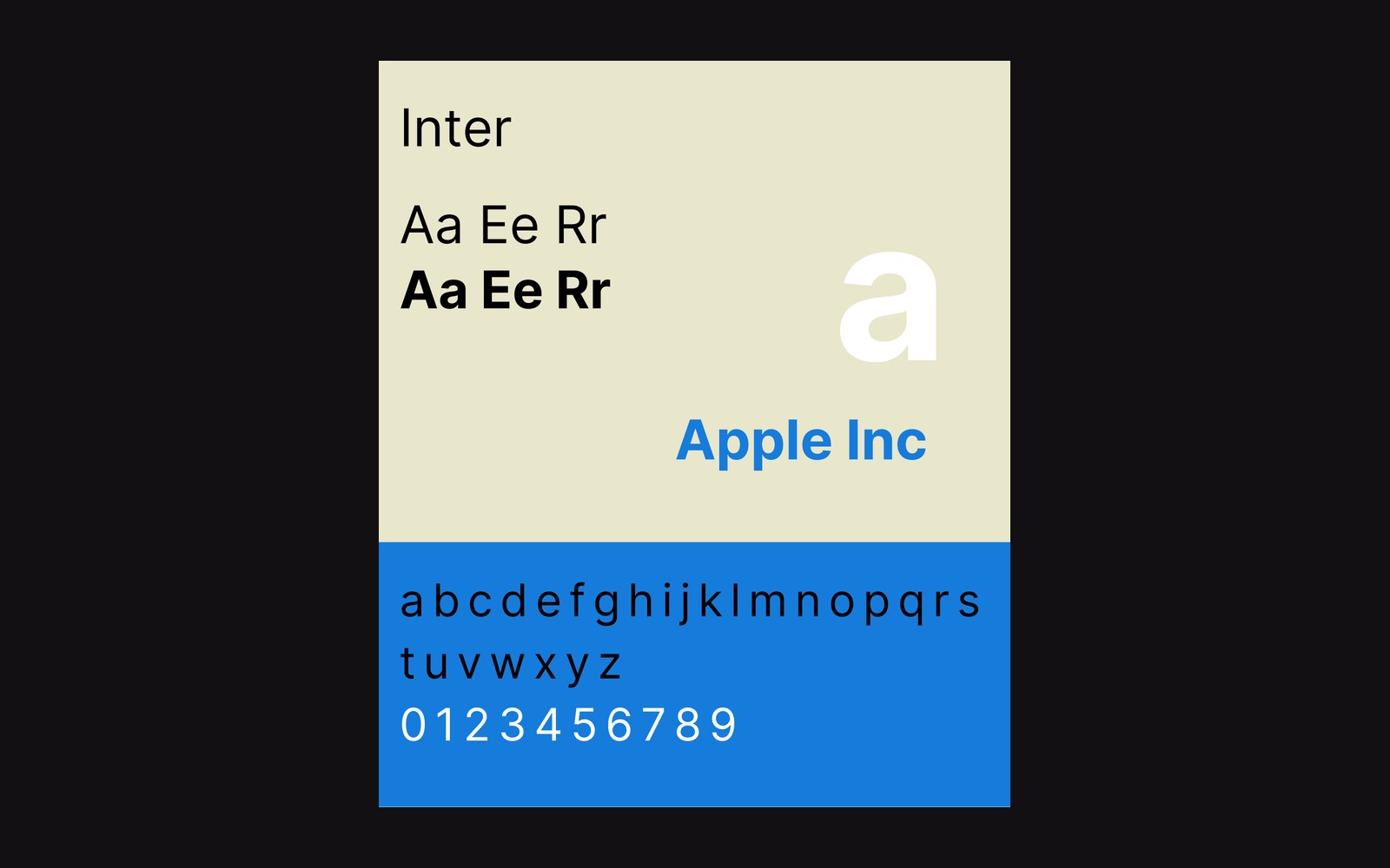
The contemporary continuation of that logic is Inter. Rasmus Andersson began the project to serve Figma's UI — a face that would hold up at the pixel sizes software interfaces demand — and released it publicly, where Google Fonts made it one of the most widely deployed typefaces on the web. Inter's x-height is high, its apertures open, its spacing tuned for screens rather than for a compositing room. The single-storey lowercase g is a deliberate choice rather than a stylistic flourish: it is simple and compact, and it stays open and clear at small sizes.
Söhne, drawn by Kris Sowersby at Klim Type Foundry, takes a different position: derived from the memory of Akzidenz-Grotesk as it appeared in print, but redrawn with the knowledge of where it would land. That is a different category from adaptation — it is reconstruction with the screen in mind at the drawing stage. The decision shows in the spacing and the weight distribution across the optical sizes.
What the screen face got that books never needed
Variable fonts, which the OpenType 1.8 specification formalised in 2016, gave screen-native faces something print faces had no use for: a continuous axis. Weight, width, optical size — adjustable per element, in real time, by the rendering environment. A print face has one job at one size. A screen face faces a viewport that could be anything, and the variable axis is the proper answer to that: not a compromise, but a design that considers the full range from the outset.
The difference between an adapted face and a drawn-for-screen face is visible in every paragraph where one is working against its origins and the other is simply doing what it was made to do.